daam
The Art of Inner Mastery in Flow
Creating a practice-based martial arts environment where movement becomes a path to presence and embodied understanding through dynamic balance.
Daam is structured around rethinking how martial arts are commonly perceived:
How can martial arts be understood not merely as combat or performance, but as an inner art that fosters clarity, harmony, and contemplation?
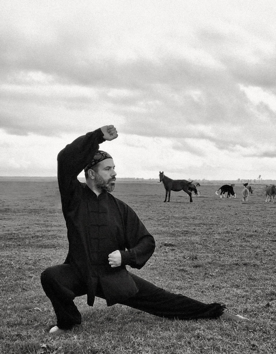
Daam Academy was developed as a practice-based martial arts environment rooted in Eastern wisdom and inner martial traditions. Drawing inspiration from Tai Chi Chuan, the project approaches martial arts not as combat or performance, but as an embodied art—where movement becomes a means of presence, reflection, and inner cultivation.
Here, movement is understood as a language of dynamic balance: soft yet strong, fluid yet grounded, shaped through continuous adjustment rather than force. Breath, posture, and attention intertwine, allowing martial practice to unfold as a contemplative discipline—one that reveals clarity through restraint and harmony through tension.
Guided by this sensibility, I shaped the project’s visual and conceptual assets to echo its inner logic—expressing balance through contrast, and strength through silence.
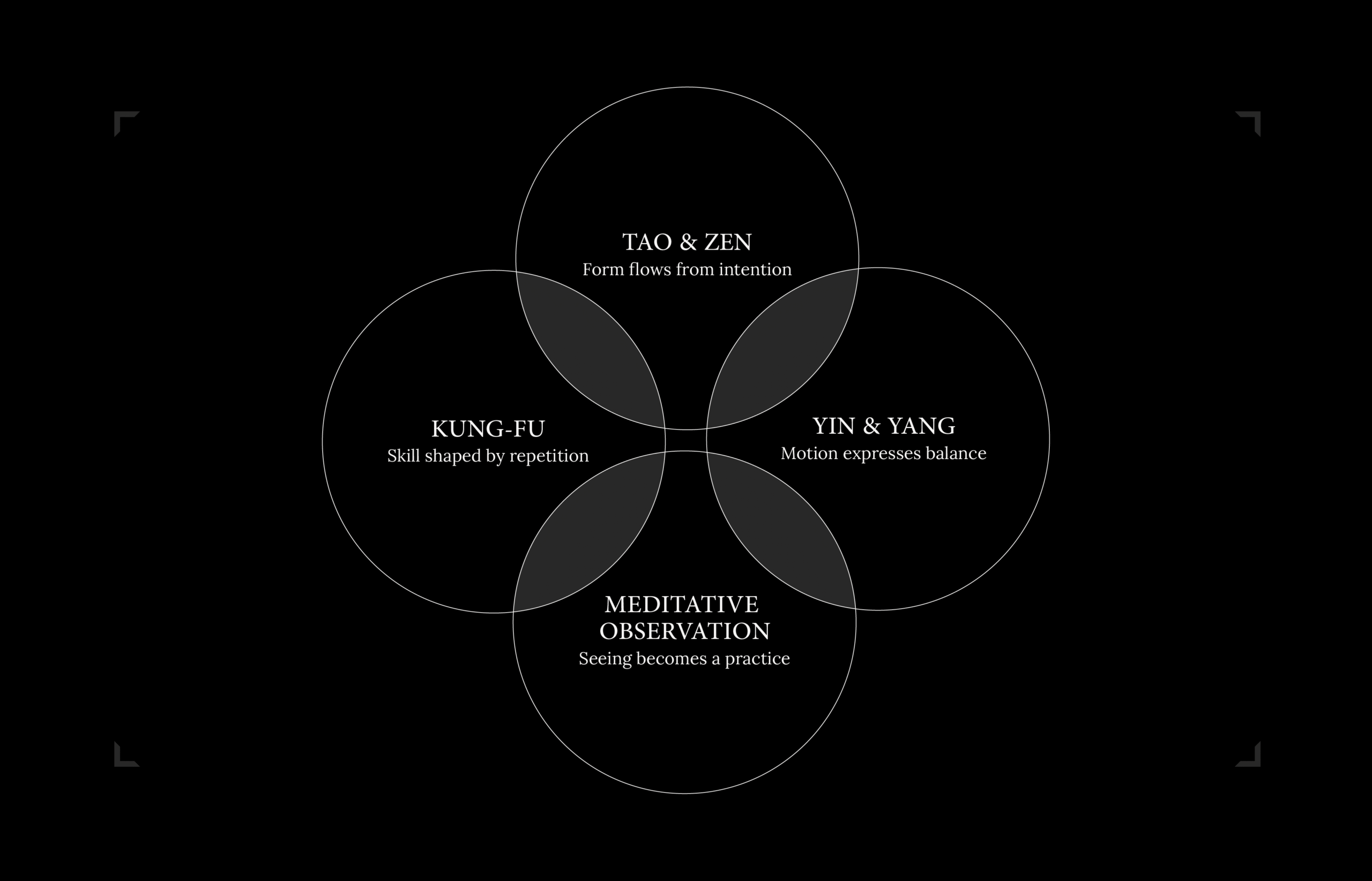
Rooted in the artistic essence of Wushu, the concept draws from its fundamental principles — Tao & Zen, Yin & Yang, Meditative Observation, and Kung Fu — approaching martial movement not merely as a physical technique, but as a disciplined art form shaped by awareness, balance, and inner harmony.
From this perspective, the visual language of Daam emerges through contrast and flow. Awareness guides form, balance structures composition, and repetition informs discipline. Identity unfolds as an embodied experience—where silence, motion, and form remain in dialogue.
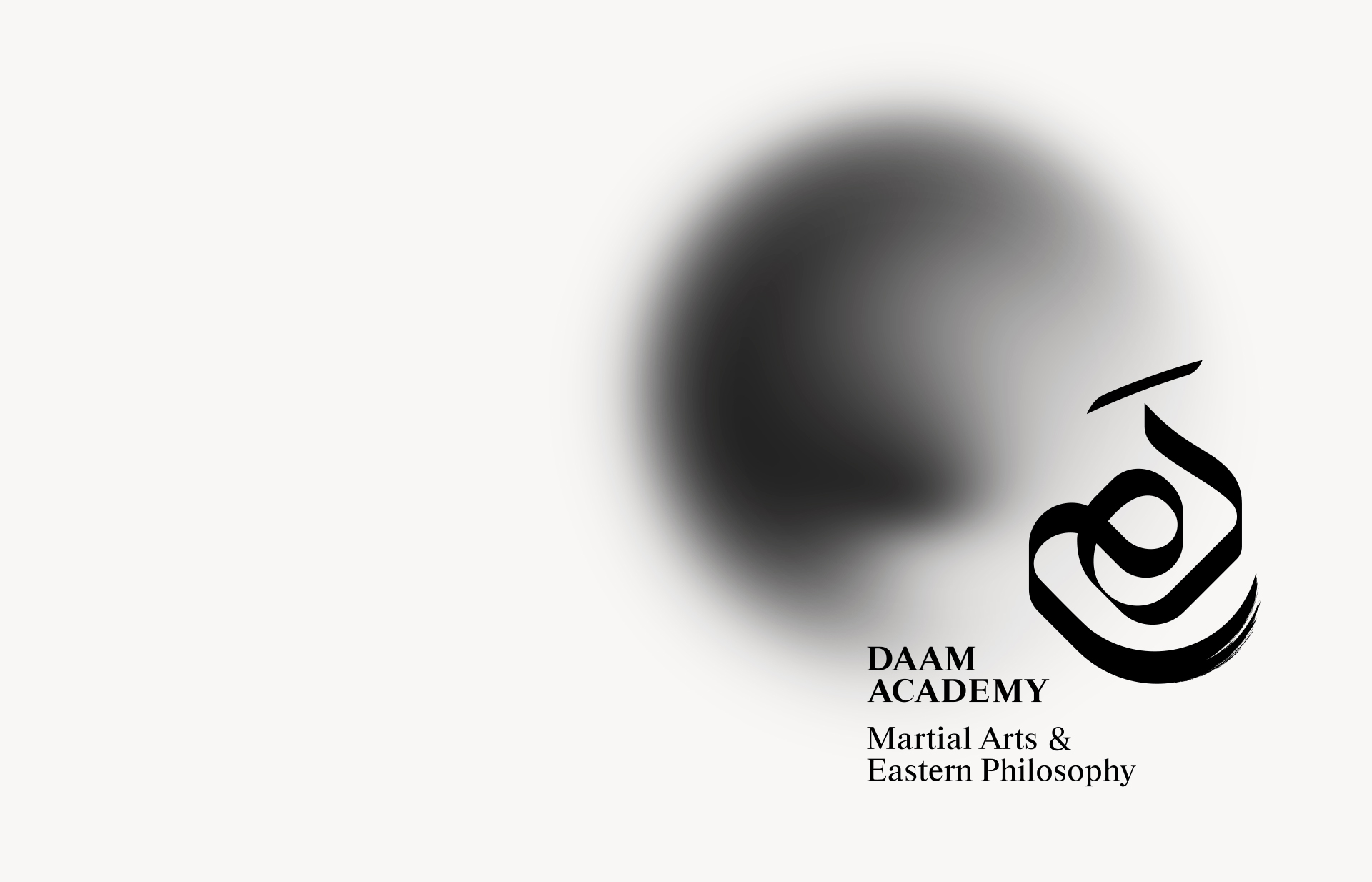
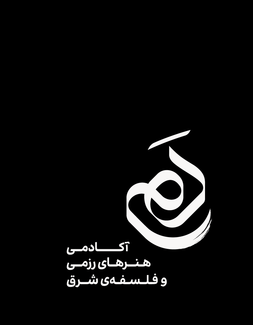
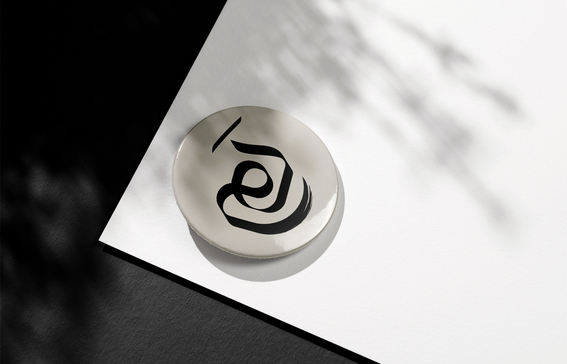
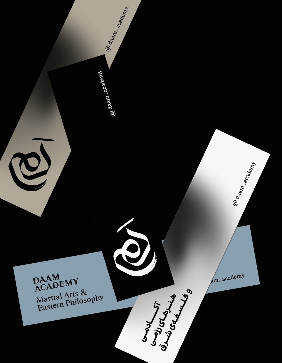
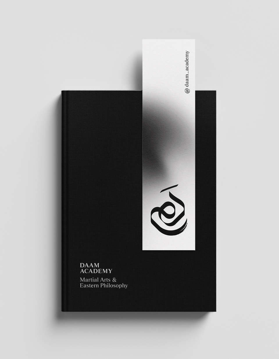
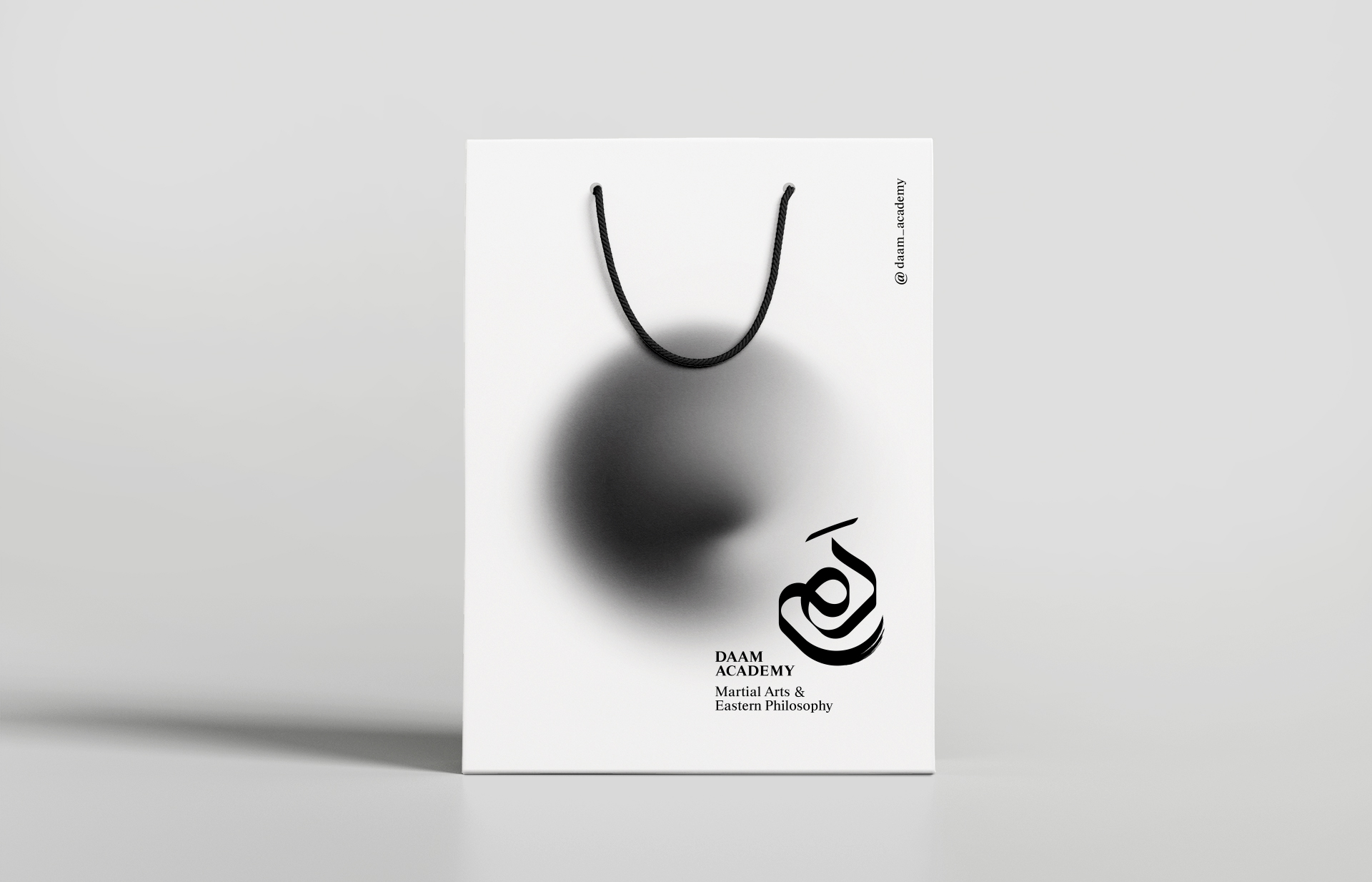
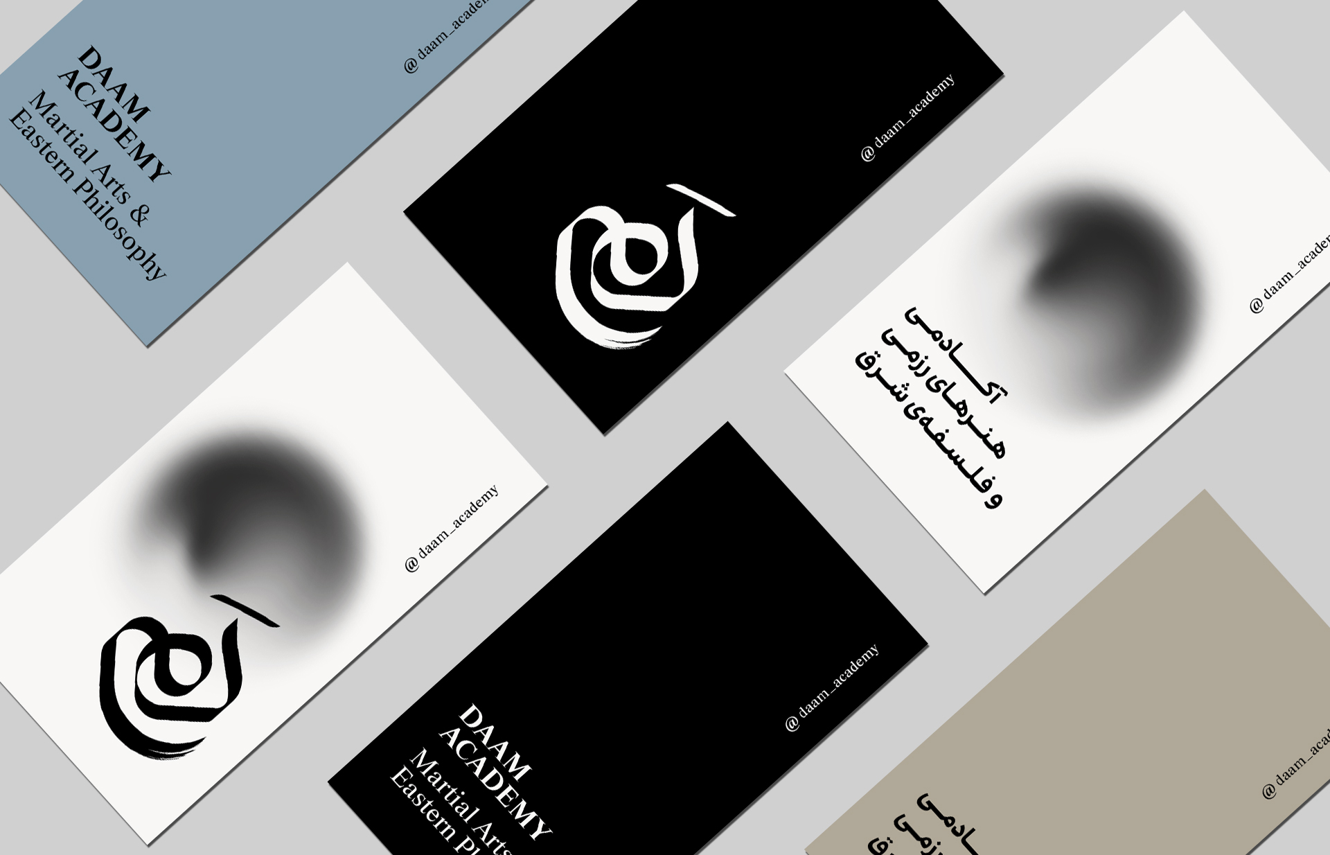
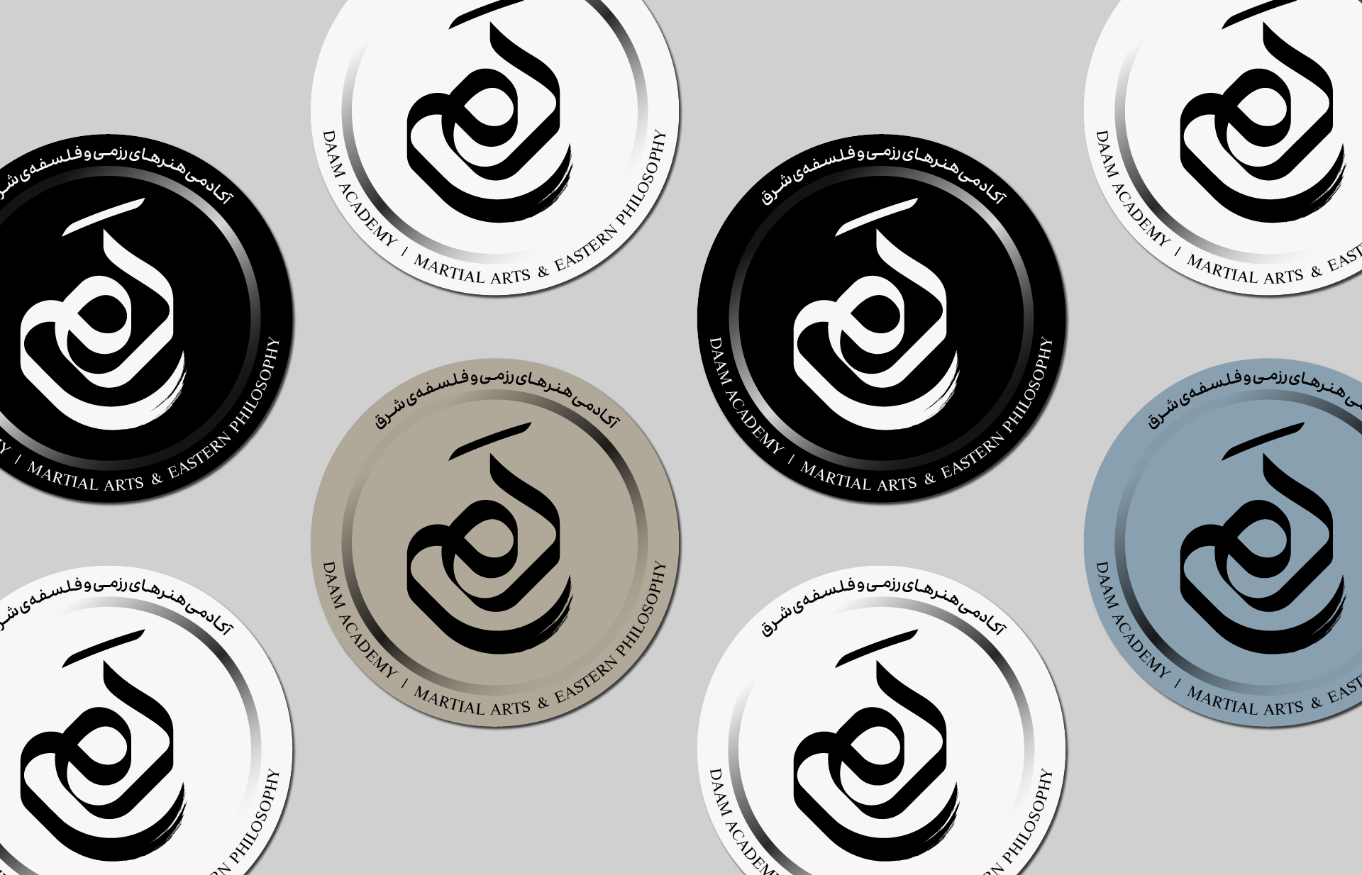
The identity centers on a calligraphic logo that merges the fluid motion of Chinese brushwork with the structural elegance of Iranian Thuluth. This fusion reflects martial movement alongside the discipline and expressive qualities of calligraphy, bringing two cultural lineages into a shared visual language.
The logo is built around dynamic balance and gradual development. Bold, continuous strokes give it strength and stability, while subtle variations in line thickness create contrast and guide attention. Positive and negative space are used to balance focus and openness.
The visual flow moves from the outer structure toward the center, where the form of “Daam” appears, inviting focus and pause, before expanding outward again—suggesting continuity, practice, and steady progression.
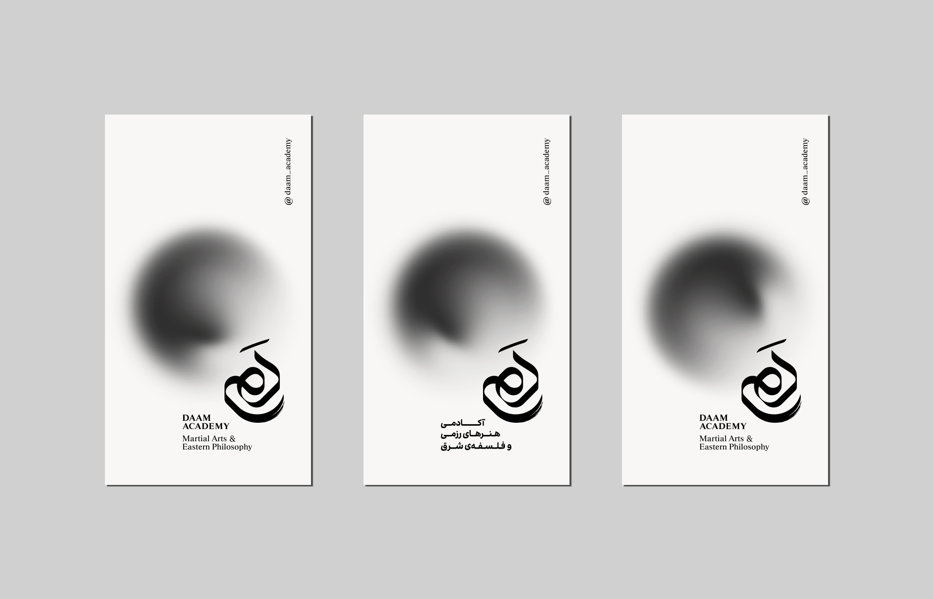
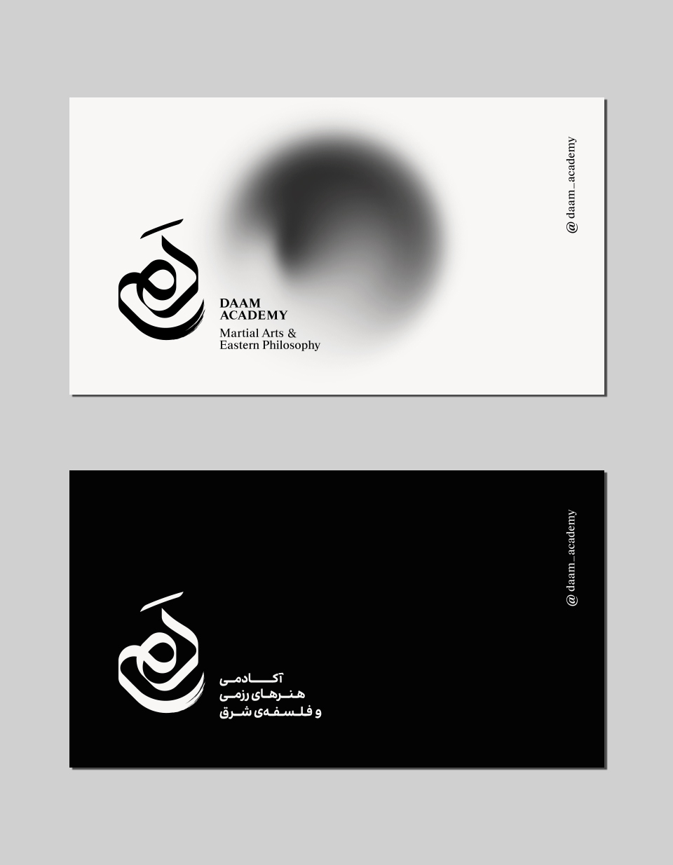

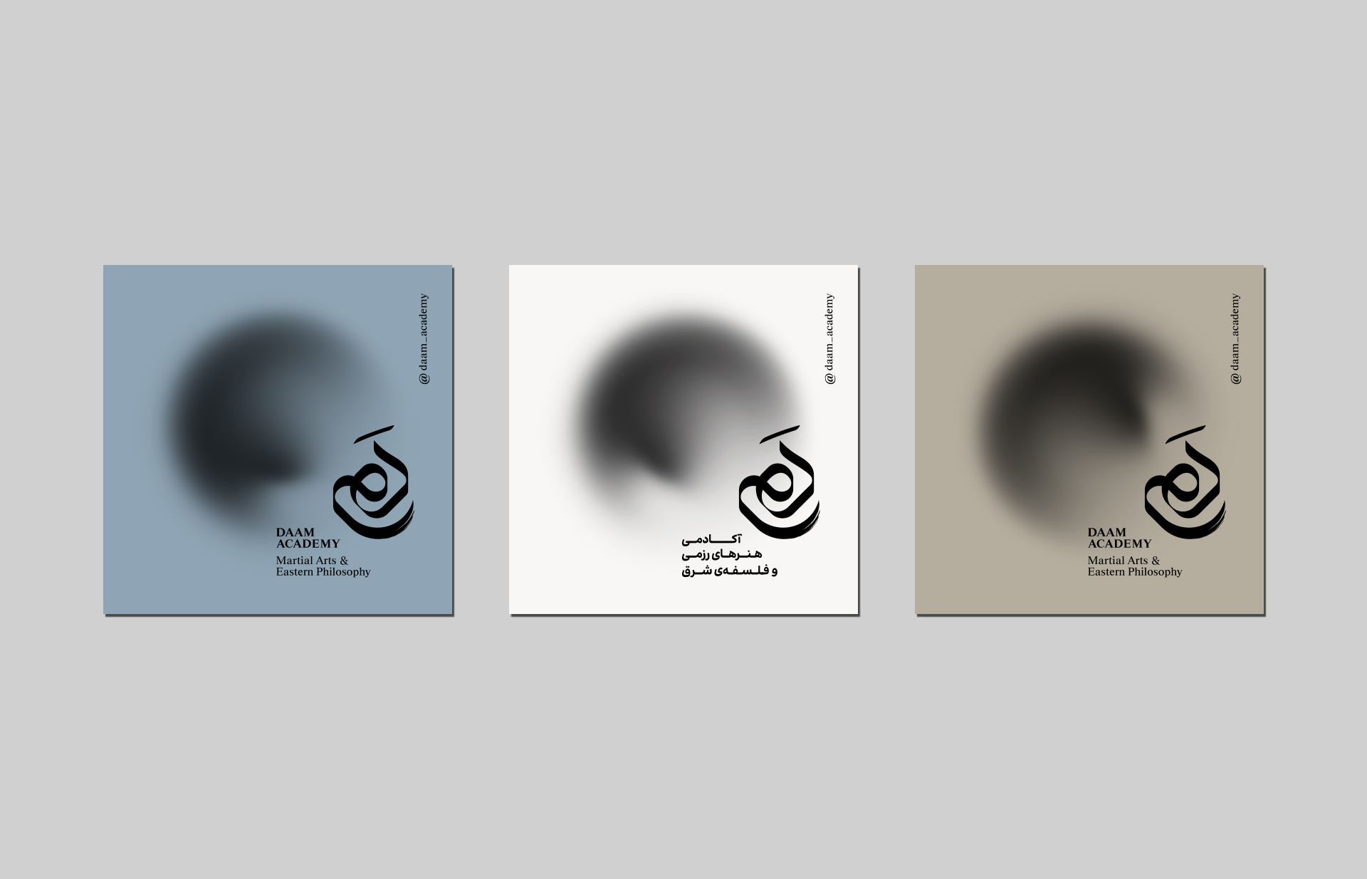
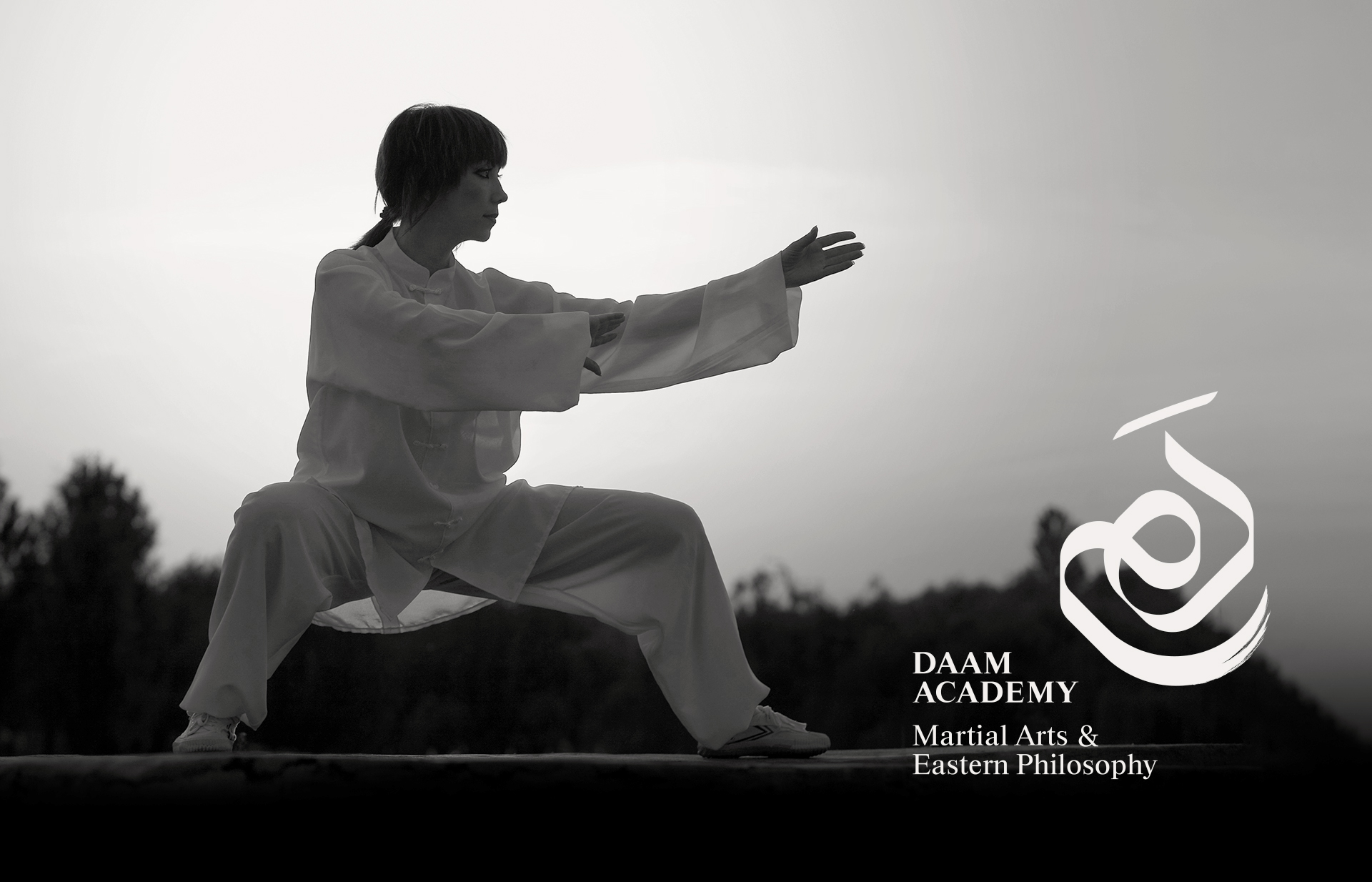
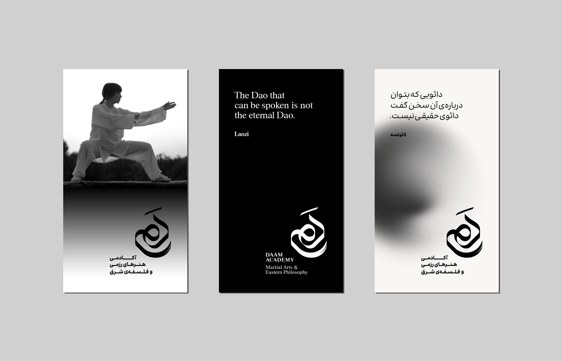
Within the visual identity of Daam Academy, gradients serve as a bridge between the physical world and the inner one. The soft radial blur evokes the contemplative atmosphere of Eastern philosophy — an abstract field of depth, stillness, and breath. In contrast, the vertical linear gradient used with photography introduces a more grounded, tangible sense of light, creating a natural transition between the captured moment and the graphic space.
Together, these two gradients — one more internal, one more external — express the essence of Daam: a harmony between inner awareness and outward movement.