fika
The Architecture ofConscious Living
A visual identity system shaped around home, everyday rituals, and shared responsibility.
Fika was conceived as a response to a simple yet complex question:
How can sustainable living become a natural and accessible part of everyday family life?
Fika is a lifestyle and beauty brand developed around the belief that sustainable living does not need to be complicated or distant from everyday life. Since 2020, it has focused on creating reusable, recyclable, and locally made products that fit naturally into daily household and self-care routines.
Grounded in the rhythm of home life, Fika translates global sustainability values into practices that feel familiar, practical, and culturally resonant within the context of Tehran. Rather than positioning systems or technologies as the primary agents of change, the brand emphasizes the role of individuals and families—encouraging small, intentional actions that accumulate into meaningful environmental impact over time.
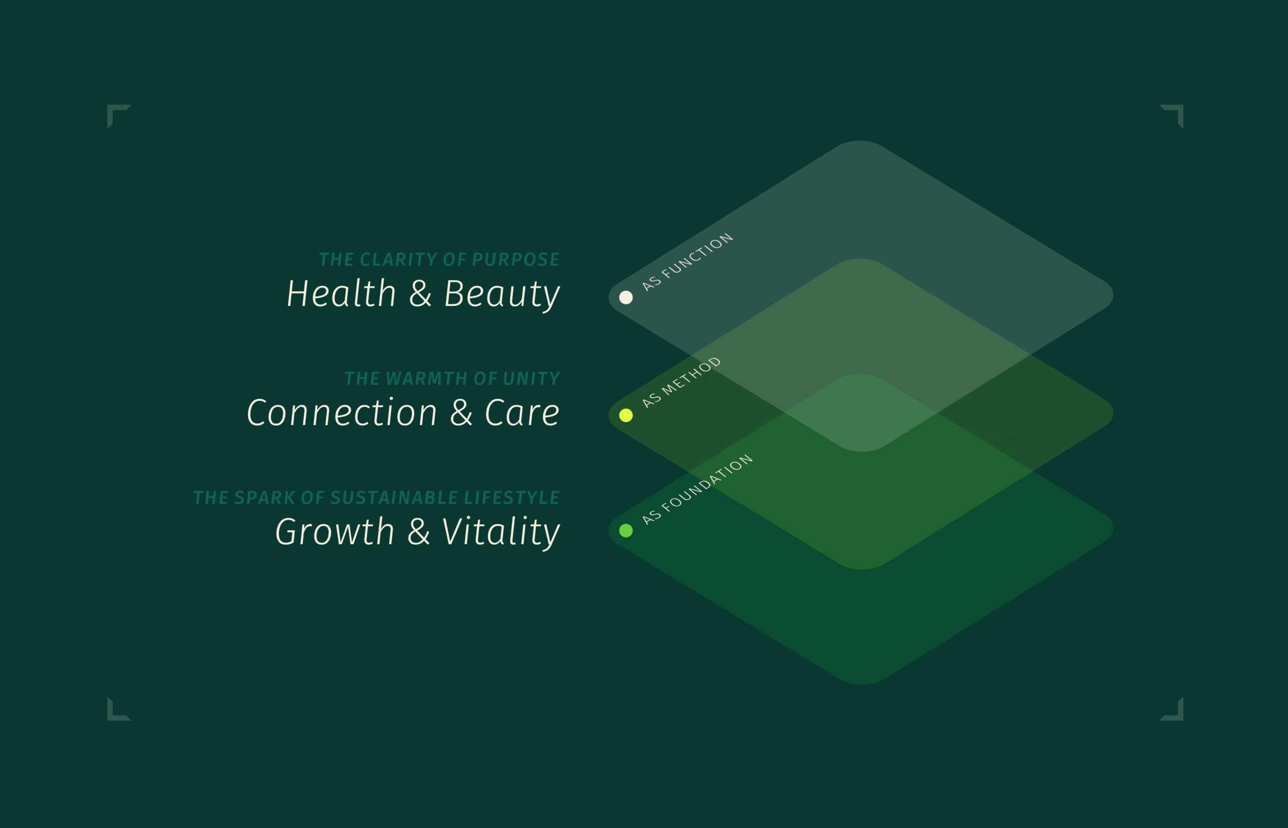
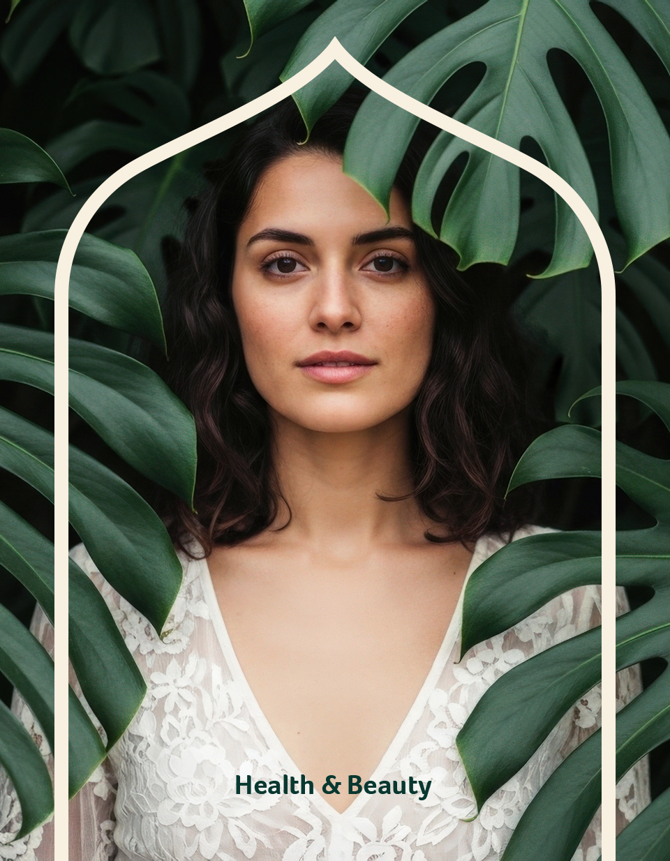
The concept is structured around three overlapping recurring themes that guide both tone and form: The spark of sustainable lifestyle (Growth & Vitality), The warmth of unity (Connection & Care), The clarity of purpose (Health & Beauty).
Rather than functioning as standalone messages, these themes inform how visual elements relate to one another within a system.
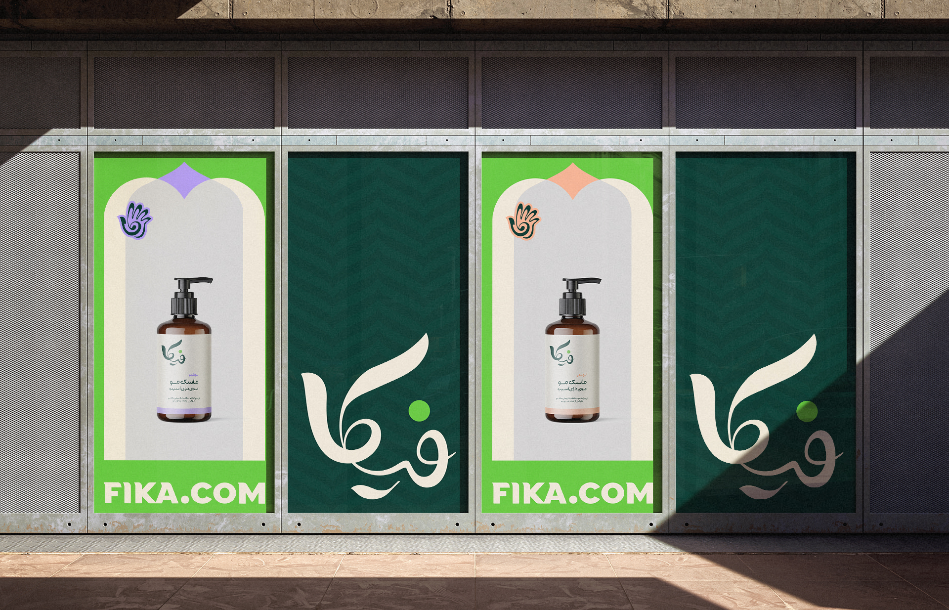
Fika’s visual identity is designed as a unified system, shaped to operate quietly across different contexts rather than as a collection of separate graphic elements. At its core, the identity unfolds through three interconnected layers: the logo as a cultural anchor, a secondary emblem as a social sign, and a modular visual structure inspired by the idea of home as the starting point of change.
By working with restrained forms and clear relationships between elements, the system remains readable and approachable across domestic, social, and public settings—supporting everyday use without demanding attention.
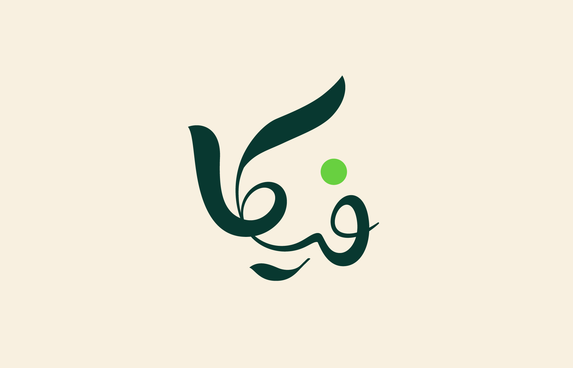
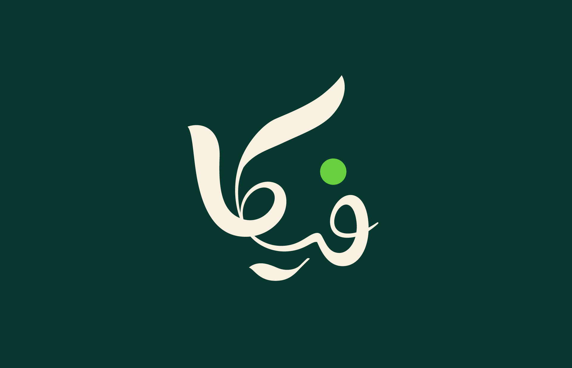
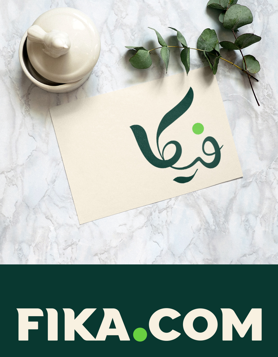
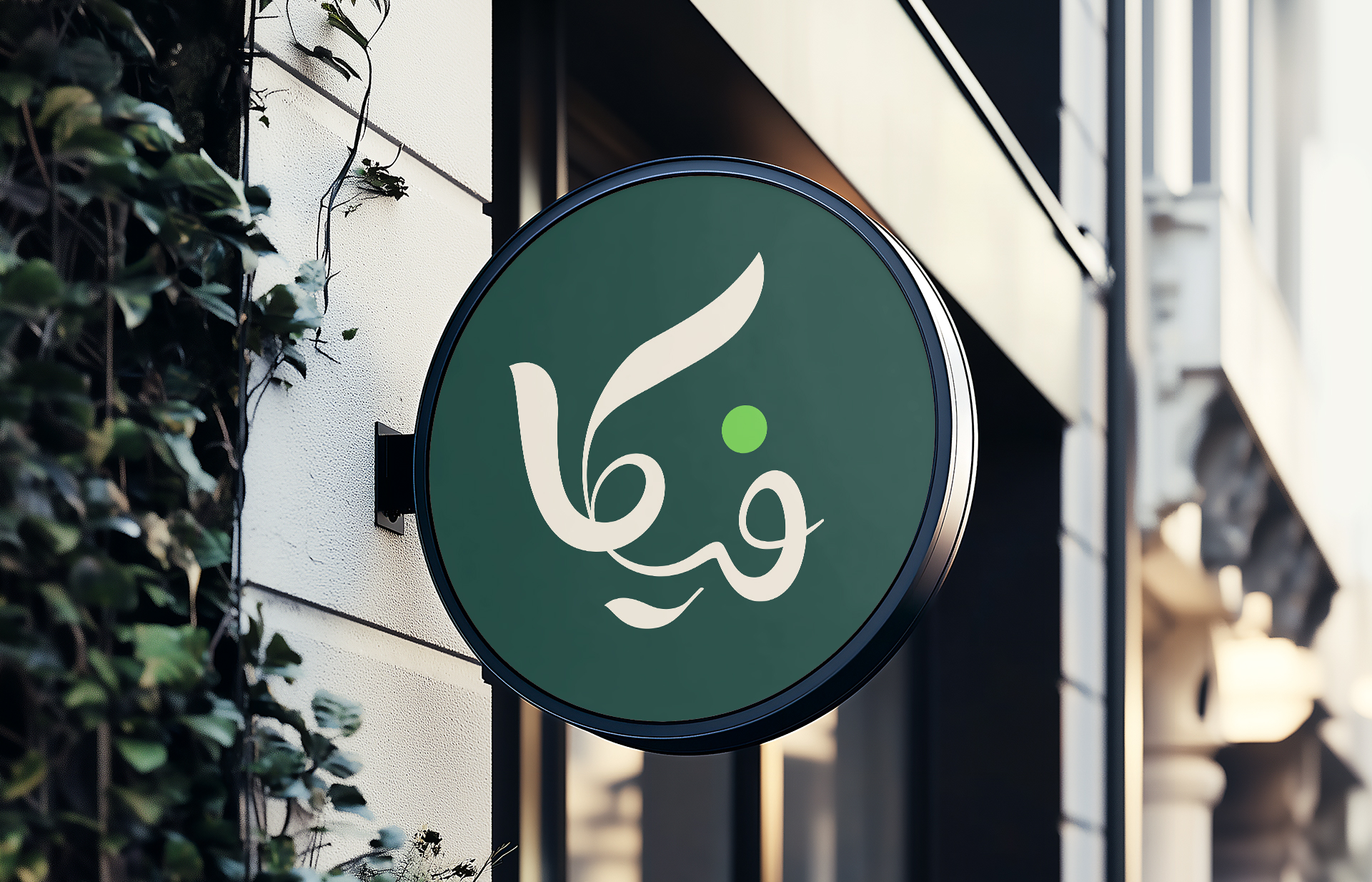
The logo is designed in flowing Persian script, anchoring the identity in its local visual culture. Its continuous right-to-left movement, combined with subtle upward and spiral-like forms, introduces a sense of Growth, Vitality, and progression rooted in natural rhythm.
Organic, fluid lines with variable stroke weight allow the mark to feel adaptable and alive across different scales, while sharper angles provide structural clarity and control. A single green dot operates as a visual point of initiation and balance, reinforcing the idea of vitality while maintaining compositional focus.
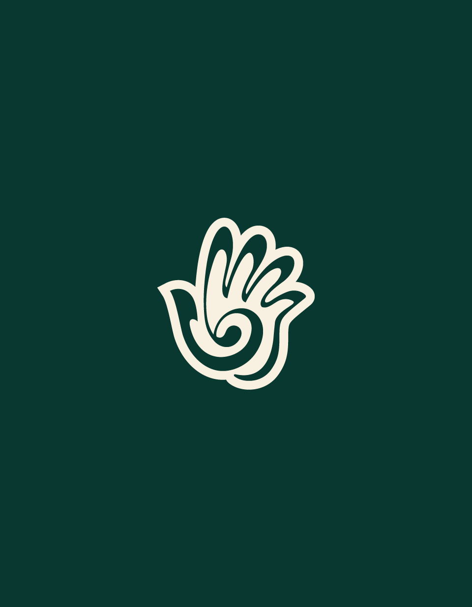
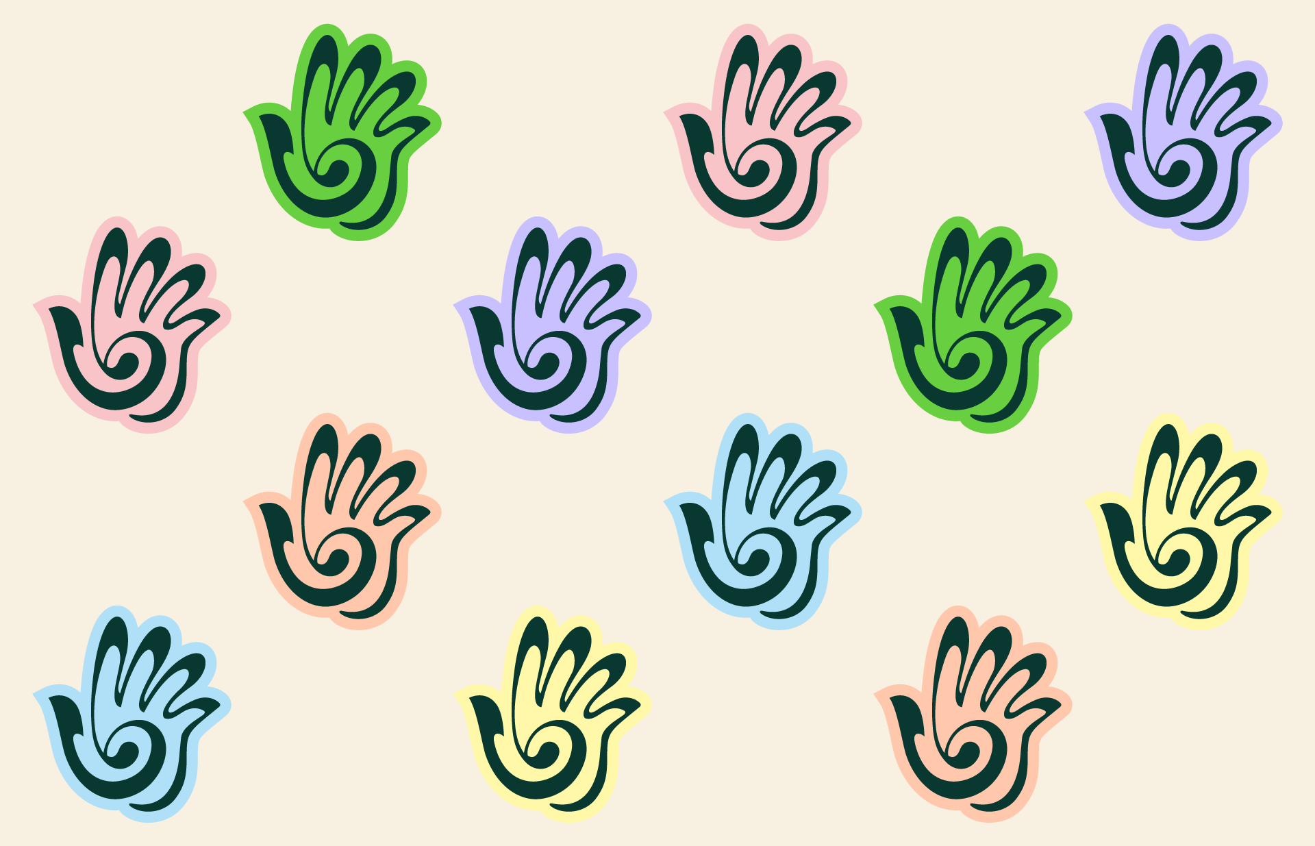
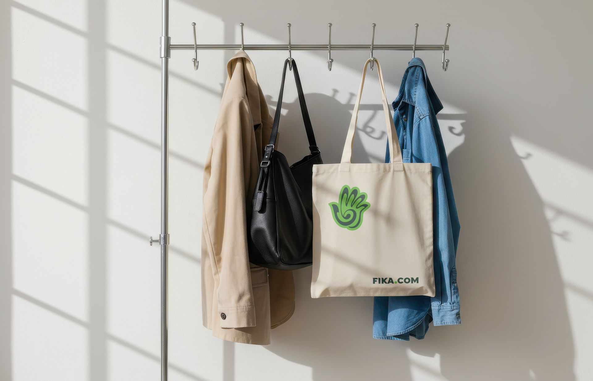
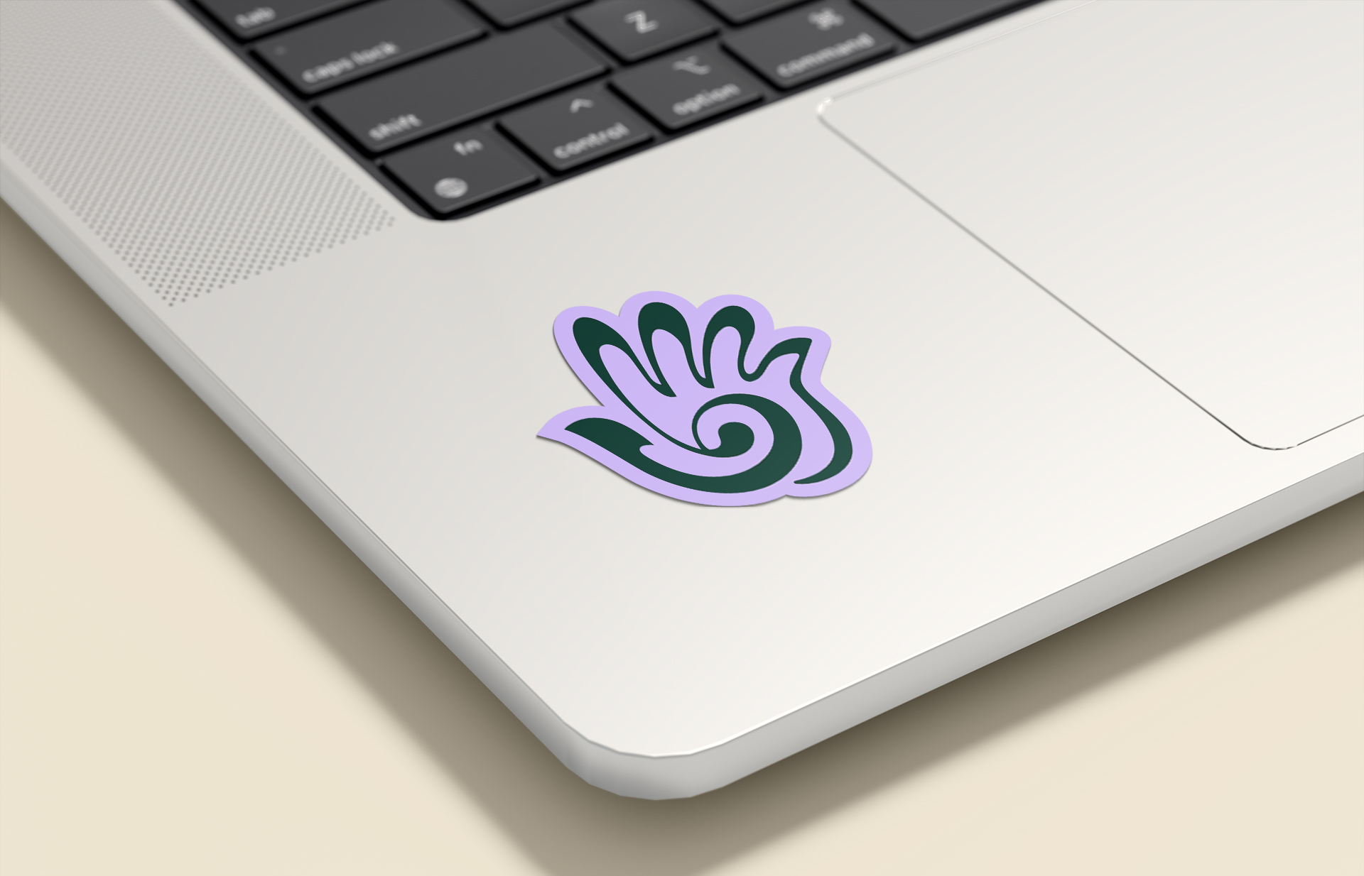
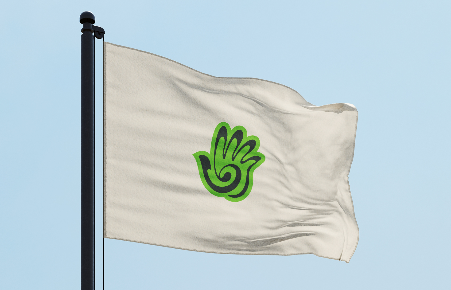
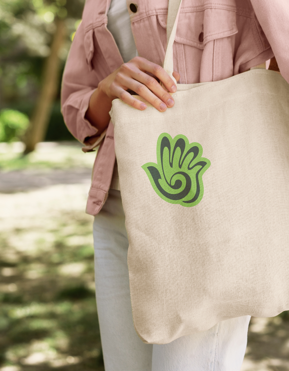
To extend the brand narrative, a secondary emblem was introduced as a personal mark—one that individuals can carry into their daily lives.
It represents collective responsibility and civic participation, operating on a social rather than commercial level.
Unlike the logo, the emblem is designed to be adopted, shared, and used freely by individuals, becoming part of personal environments rather than branded spaces. In doing so, it embodies Fika’s belief that sustainability grows from within: from our homes, care practices, conversations, and everyday routines—transforming a graphic element into a quiet social gesture of care and responsibility.
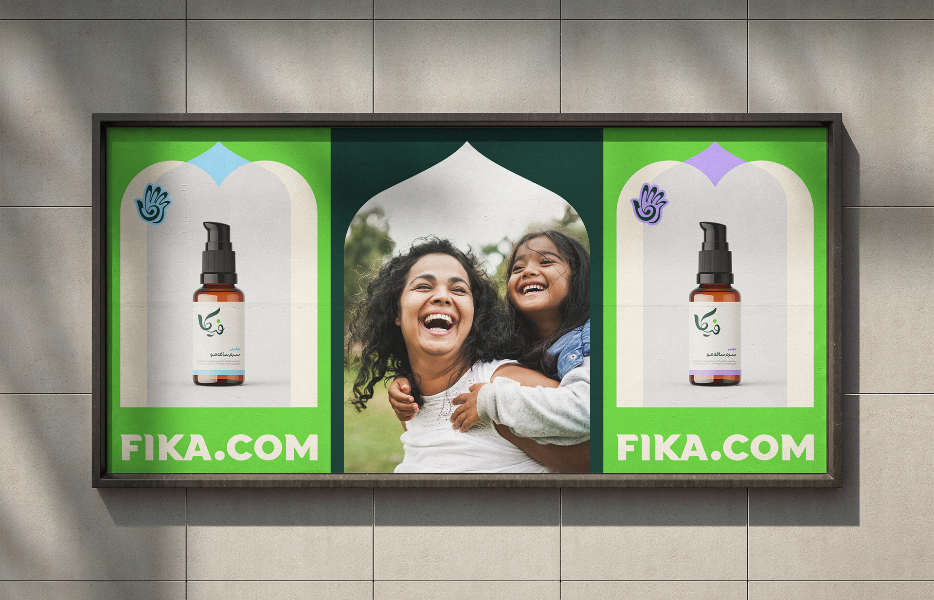

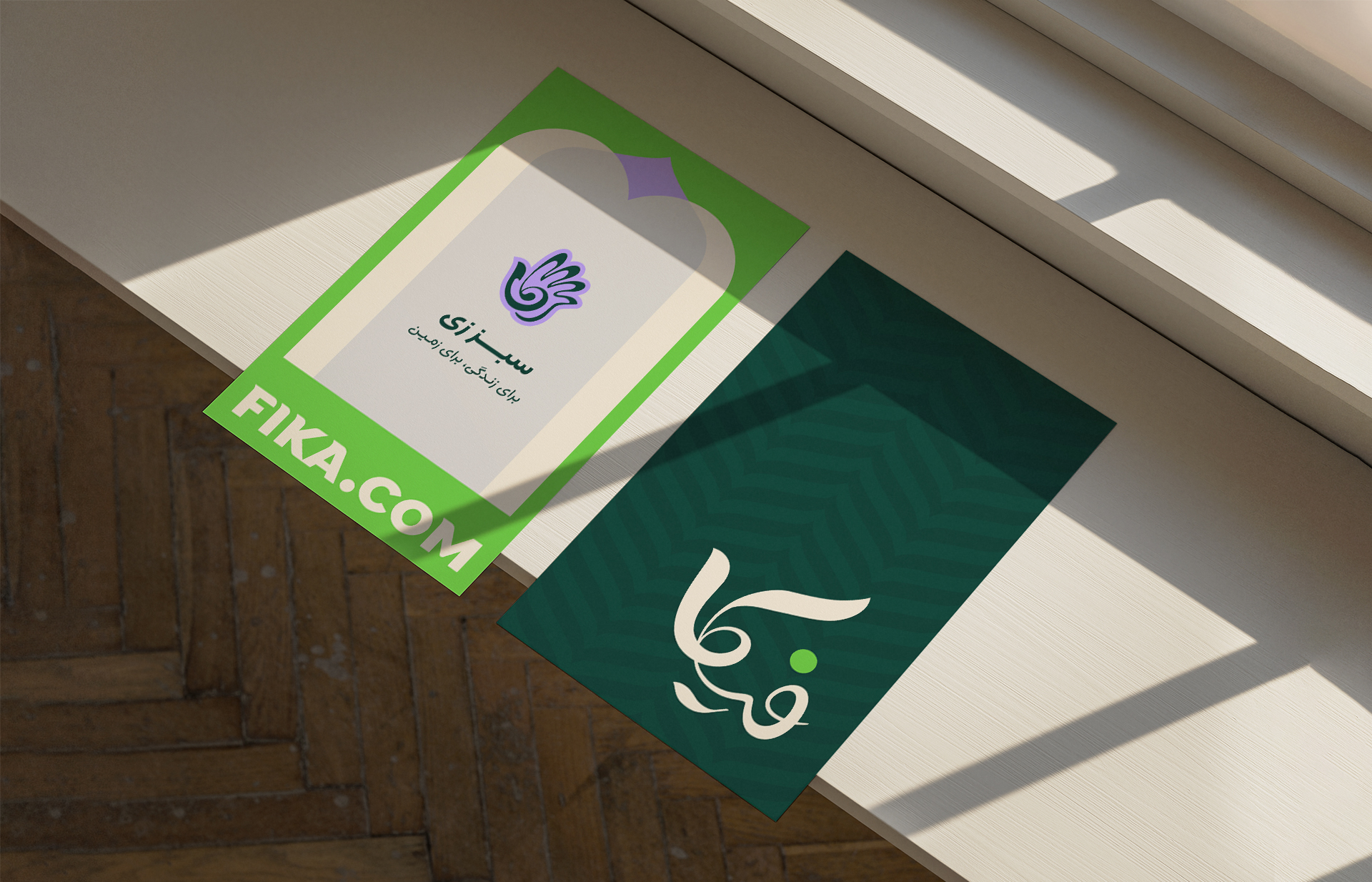
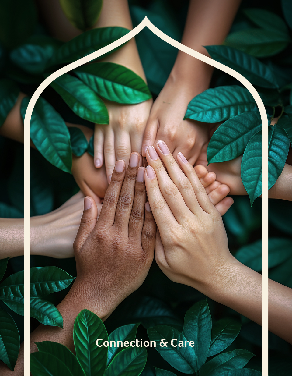
The visual environment further extends through the symbol of the home, understood as the smallest unit of collective change. Layouts and structural elements draw inspiration from traditional Iranian architecture, including eyvān and arch motifs, translated into simplified geometric surfaces and modular compositions.
As these familiar forms gradually appear, overlap, and move closer together, they form a visual metaphor for the connection, belonging, and unity that emerge from domestic life. In this system, the home is positioned not only as a physical structure, but as the emotional and cultural foundation where new behaviors take root.