tanoman
Beyond Performance
A co-founded fitness-tech project examining how design can reshape everyday exercise and body awareness.
Tanoman began with a design-driven inquiry shaped by personal experience and broader observations of contemporary fitness culture:
How might exercise be re-framed as a personal and meaningful practice—one that supports physical engagement while cultivating bodily awareness and self-directed care?
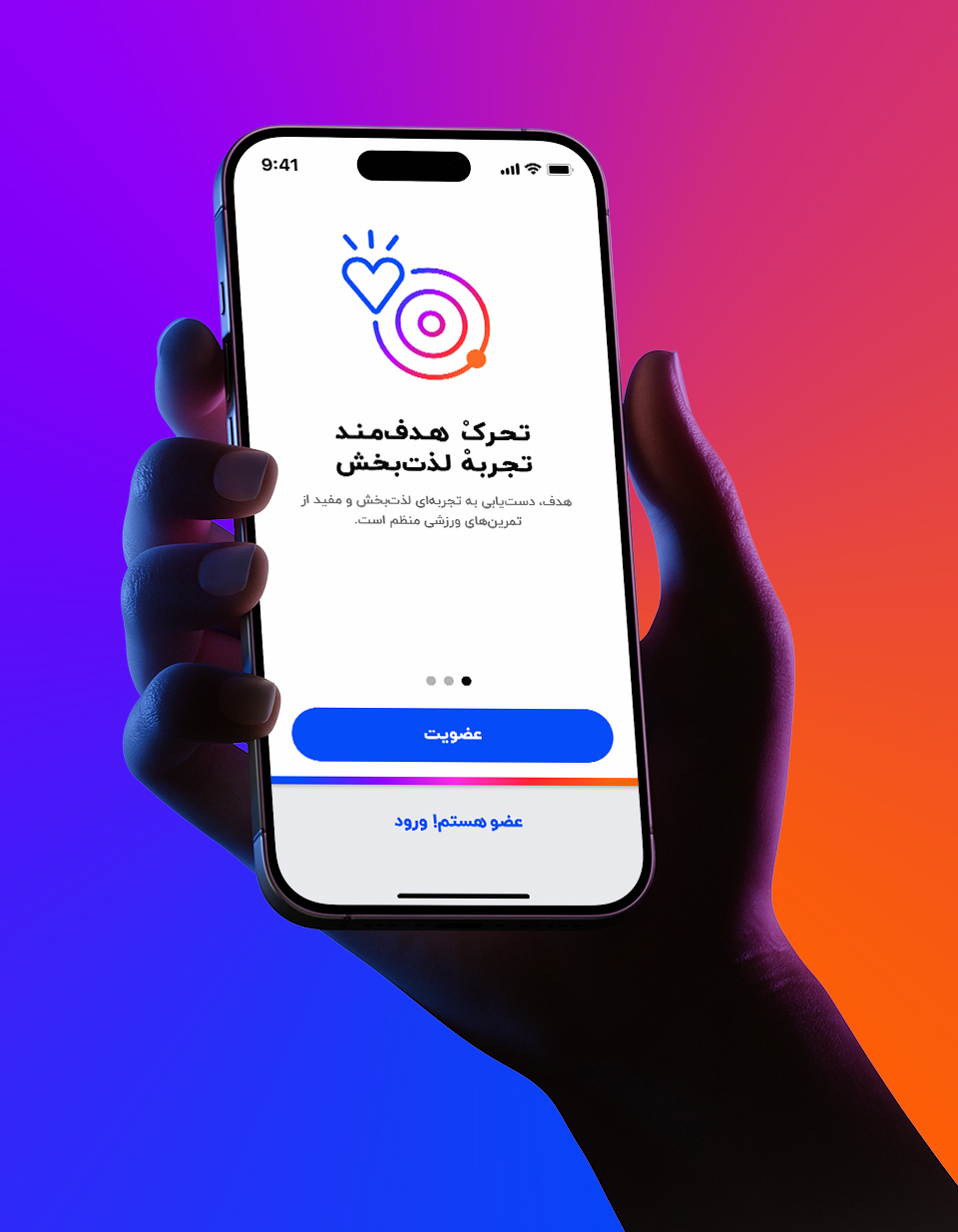
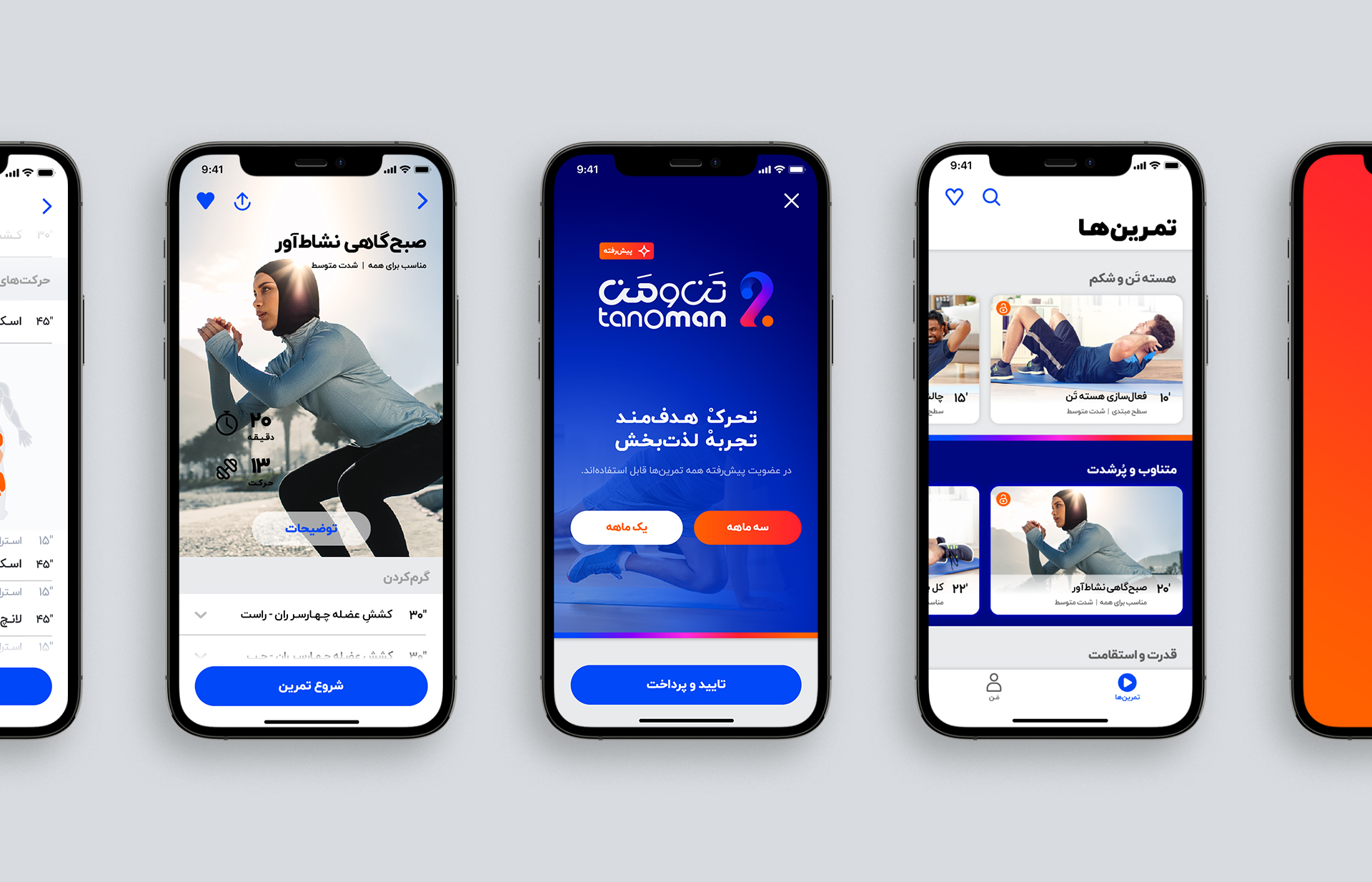
Tanoman was initiated as a fitness-tech project based in Iran for urban adults, approaching exercise as a joyful ritual of self-led movement and embodied self-care. In a world shaped by noise and pressure, it encourages users to let go of perfection and listen to their bodies—moving with intention rather than performance.
The project challenges dominant fitness narratives centered on optimization and external metrics, exploring movement, breath, and pacing as design materials for cultivating attentiveness, continuity, and bodily awareness. Rather than focusing on achievement, Tanoman emphasizes personal rhythm, presence, and the freedom of moving on one’s own terms.
As co-founder and creative director, I guided the project’s conceptual framing and visual direction, shaping how its ideas were translated into design decisions.

The design process of Tanoman began with naming and mark-making, understood not simply as branding steps but as the conceptual foundation of the project. As a co-founder and creative lead, I approached Tanoman as a personal inquiry—connecting my own questions about the body, movement, and self-care with design practice. The project was shaped by a central concern: how to relate to the body with awareness and responsibility rather than pressure.
Tanoman emerged at the intersection of two perspectives: the Western focus on fitness and outcomes, and the Eastern emphasis on presence, rhythm, and embodied attention—allowing design to mediate between performance and listening.
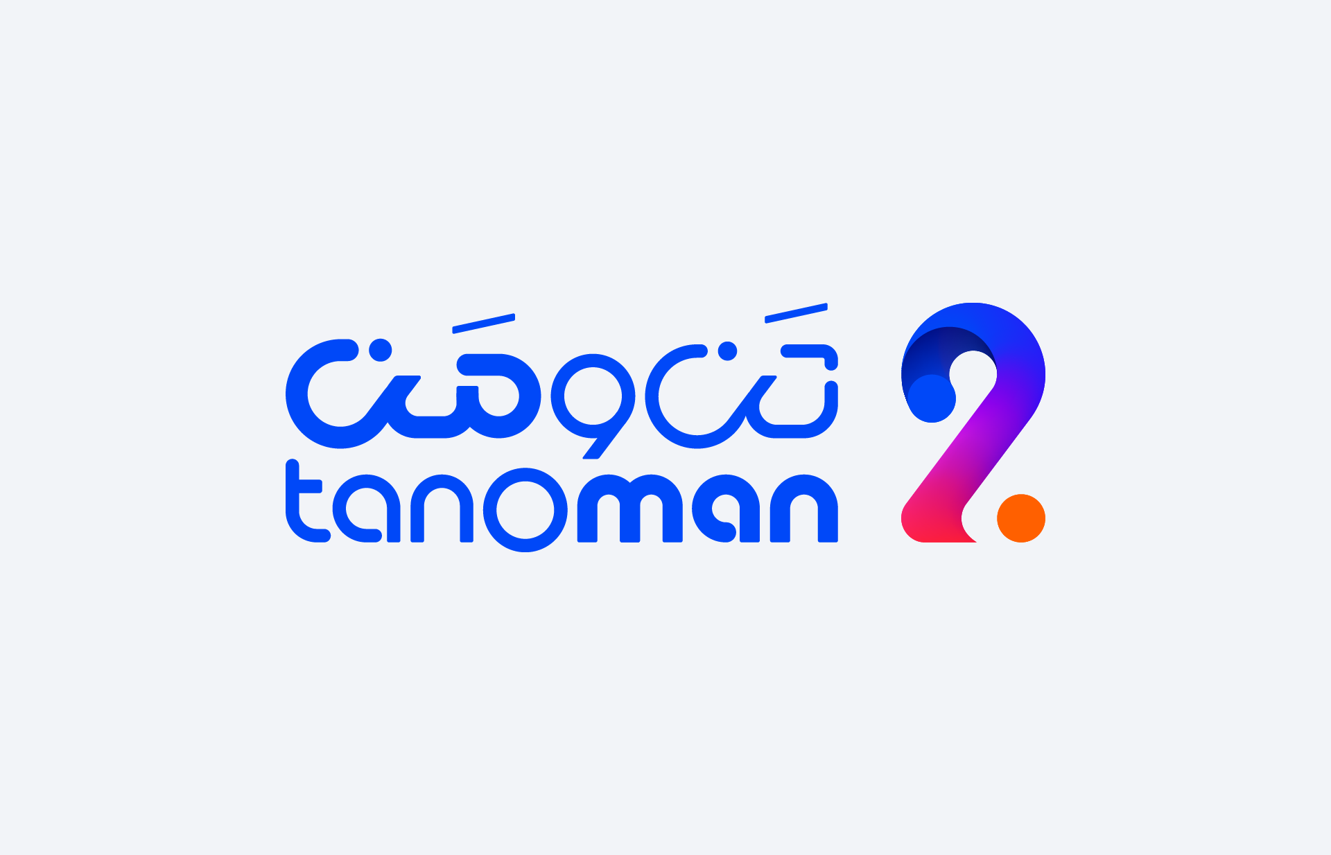
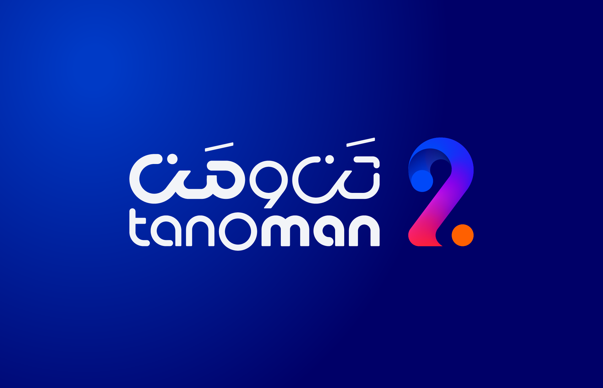

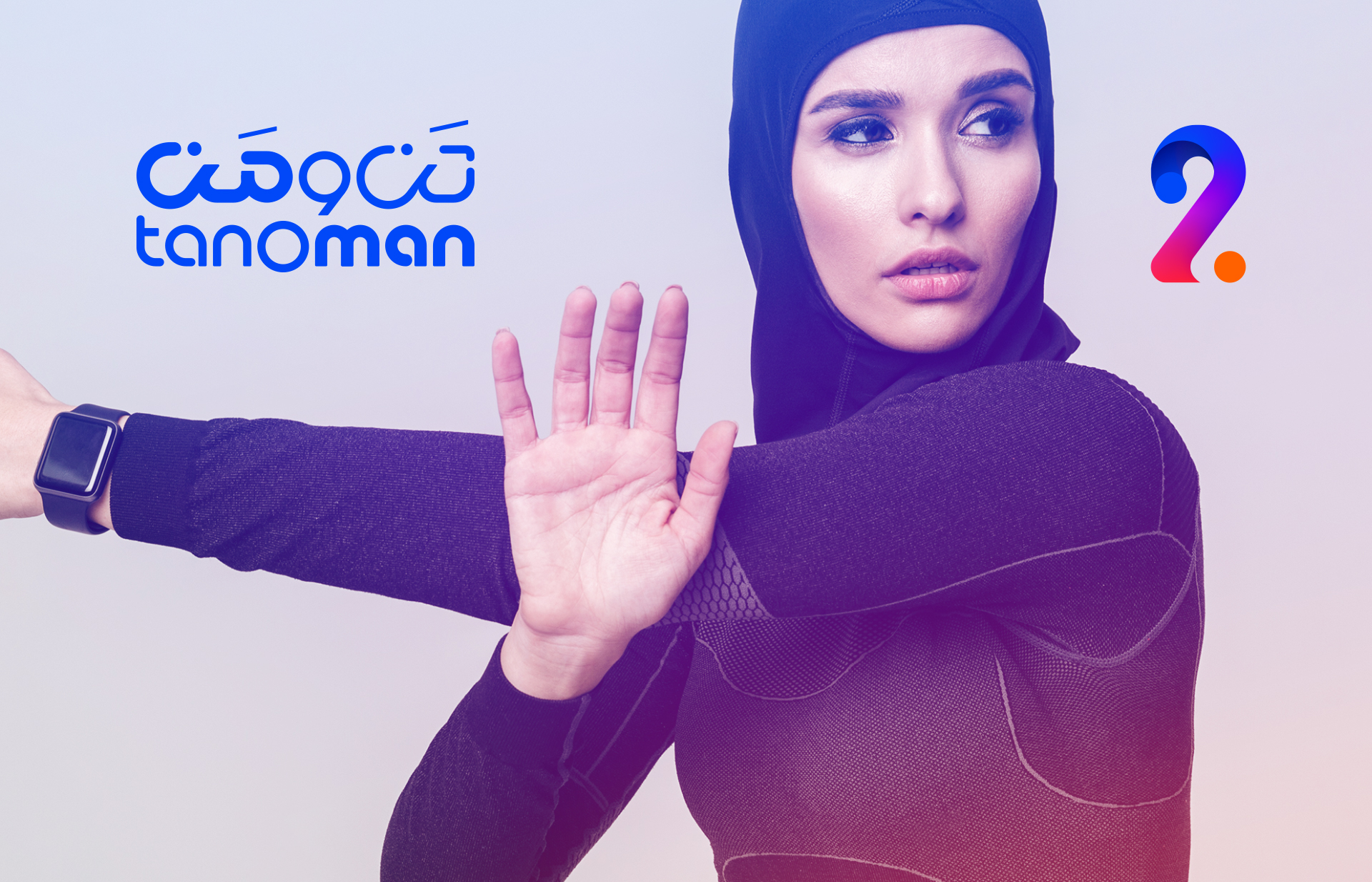
Tanoman is conceived as a sign of connection—a crafted Persian compound of tan (body) and man (self/mind). It expresses the brand’s core idea: forming a joyful and responsible relationship with the body. The “o” between them functions as both a sound and a visual bridge, symbolizing the connection between body and mind.
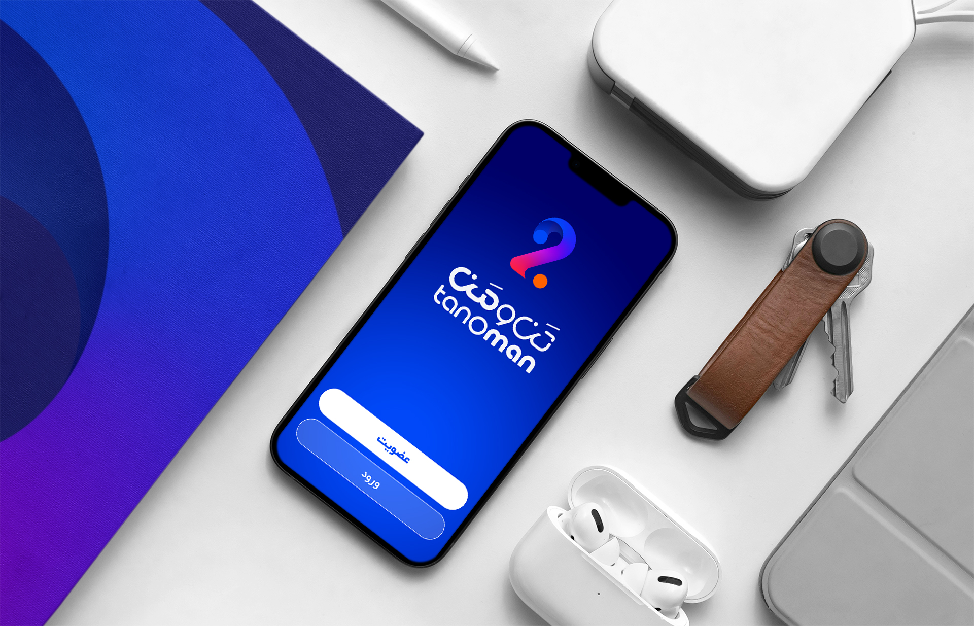
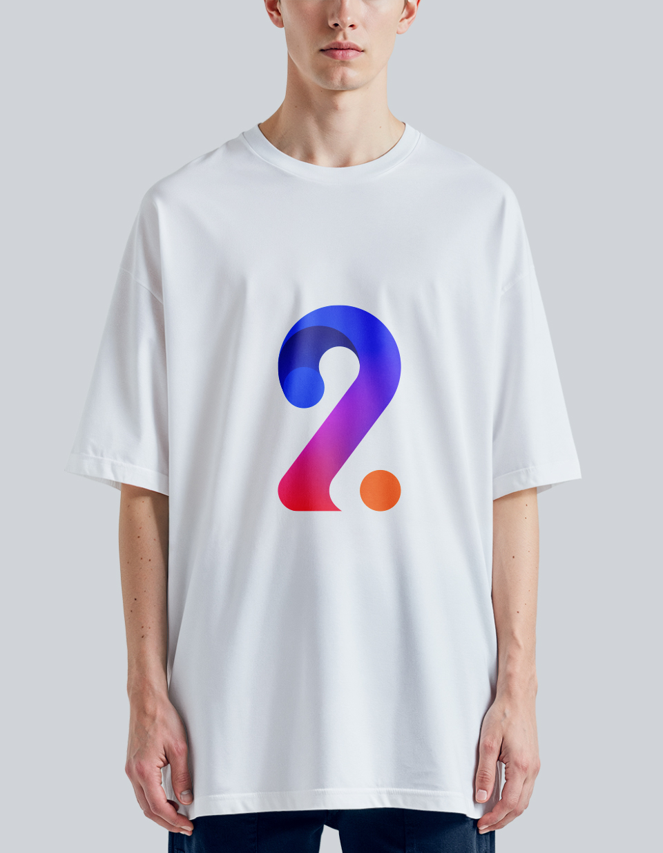
This concept directly shaped the logo. The mark uses vibrant forms and color relationships to express three states: the energized body (orange), the confident mind (blue), and the playful connection between them (a dynamic gradient path). The resulting visual language is intentionally lively and expressive—reflecting Tanoman’s invitation to know the body through movement, presence, and fun.